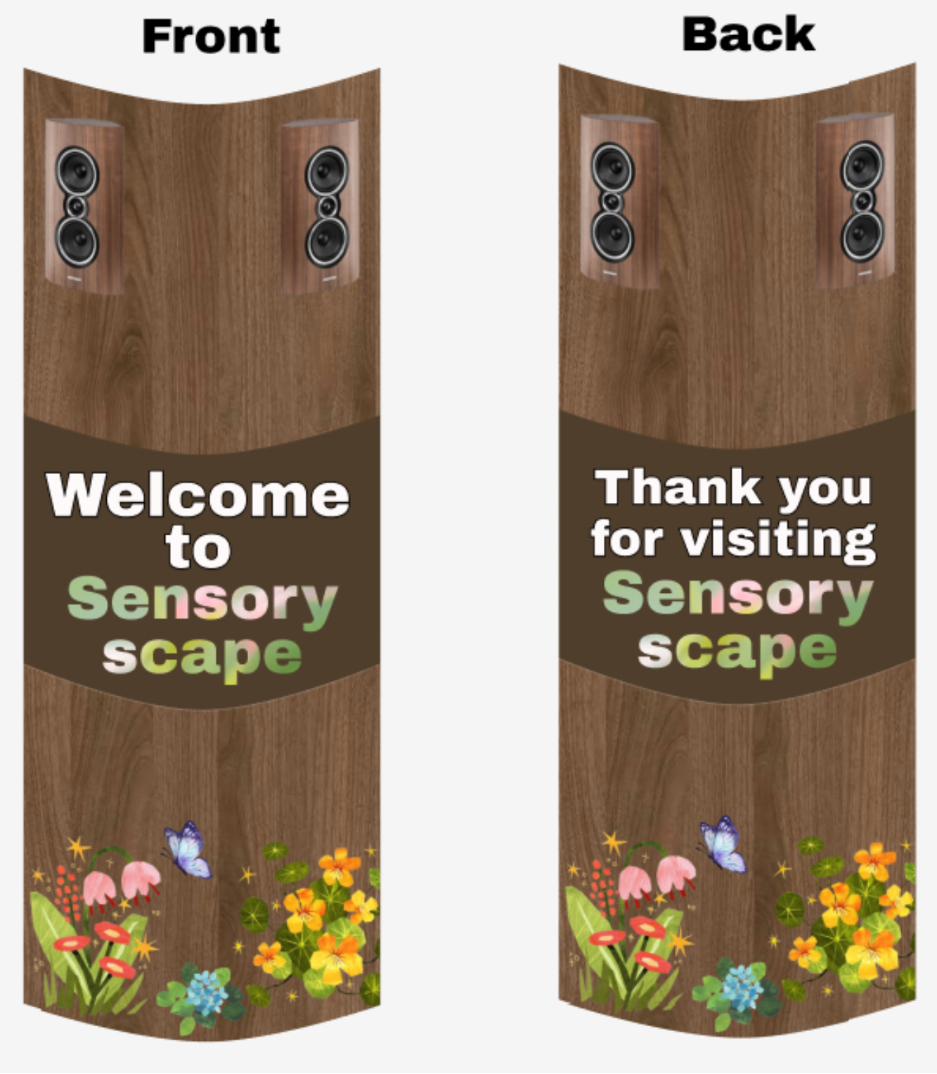
Entrance Totem for Sensory Scape
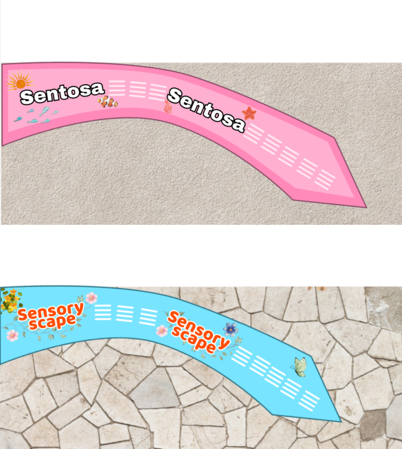
Floor Wayfinding Signs leading to Sensory Scape
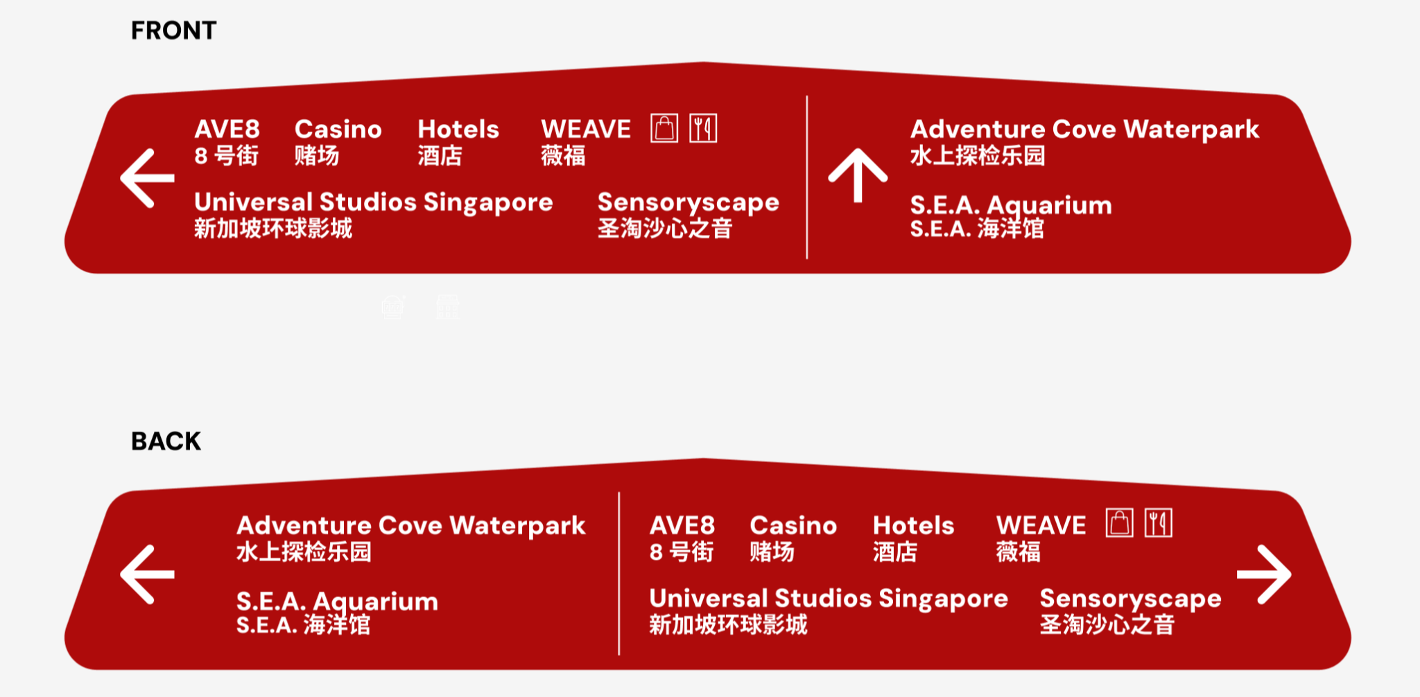
Overhead Signage for Sentosa
Logic behind the system
1. Color Coding
- Sentosa (Pink Path): The bright pink with marine and beach-themed icons (sun, shells, fish) evokes fun and tropical energy which is ideal for guiding visitors in a leisure destination.
Sensoryscape (Blue Path): The soft blue with natural, floral elements and butterflies creates a calming and immersive mood aligned with the sensory experience in the area.
2. Iconography
• Sentosa Path: The sun, coral, and fish elements/icons are symbols of fun and adventure.
• Sensoryscape Path: The flowers, butterflies, and musical notes icons evoke nature and multi-sensory engagement.
• Directional Signage: Universal icons for walking, lift, and escalator are used for intuitive understanding regardless of language. These visual cues help reduce cognitive load and support wayfinding for all ages and language backgrounds.
3. Spatial Hierarchy & Flow
- Arrows and Path Design: The curved paths with arrows guide movement naturally and physically.
- Dual-facing Direction Boards: The overhead signage has mirrored front and back layouts, providing orientation in both directions of travel. This ensures clear navigation regardless of entry point and supports continuous user flow.
4. Naming Conventions
- Names like “Sensoryscape” and “Sentosa” are consistently and prominently repeated along paths, reassuring users that they are on the right path
- Attractions are written in both English and Chinese, reflecting bilingual inclusivity, which would be helpful and useful to foreigners visiting the area.
5. Accessibility
- Text Contrast: White text on pink/blue backgrounds ensures strong readability due to its contrast in colour.
- Pictorial Aids: The icons on the signage, such as arrows or floral elements, help assist non-readers or visually impaired users.
- Auditory Elements: The musical notes and speaker graphics imply soundscapes, supporting multi-sensory inclusivity. Chimes and birds chirping will be played to let visually impaired users know that they are on the right track to the Sensoryscape.
6. Usability Principles
- Feedback: Arrows, paths, and signposts reassure users that they’re on track.
- Simplicity: The signage has no clutter, and only essential details are shown, making it digestible for users in a busy and crowded setting.